


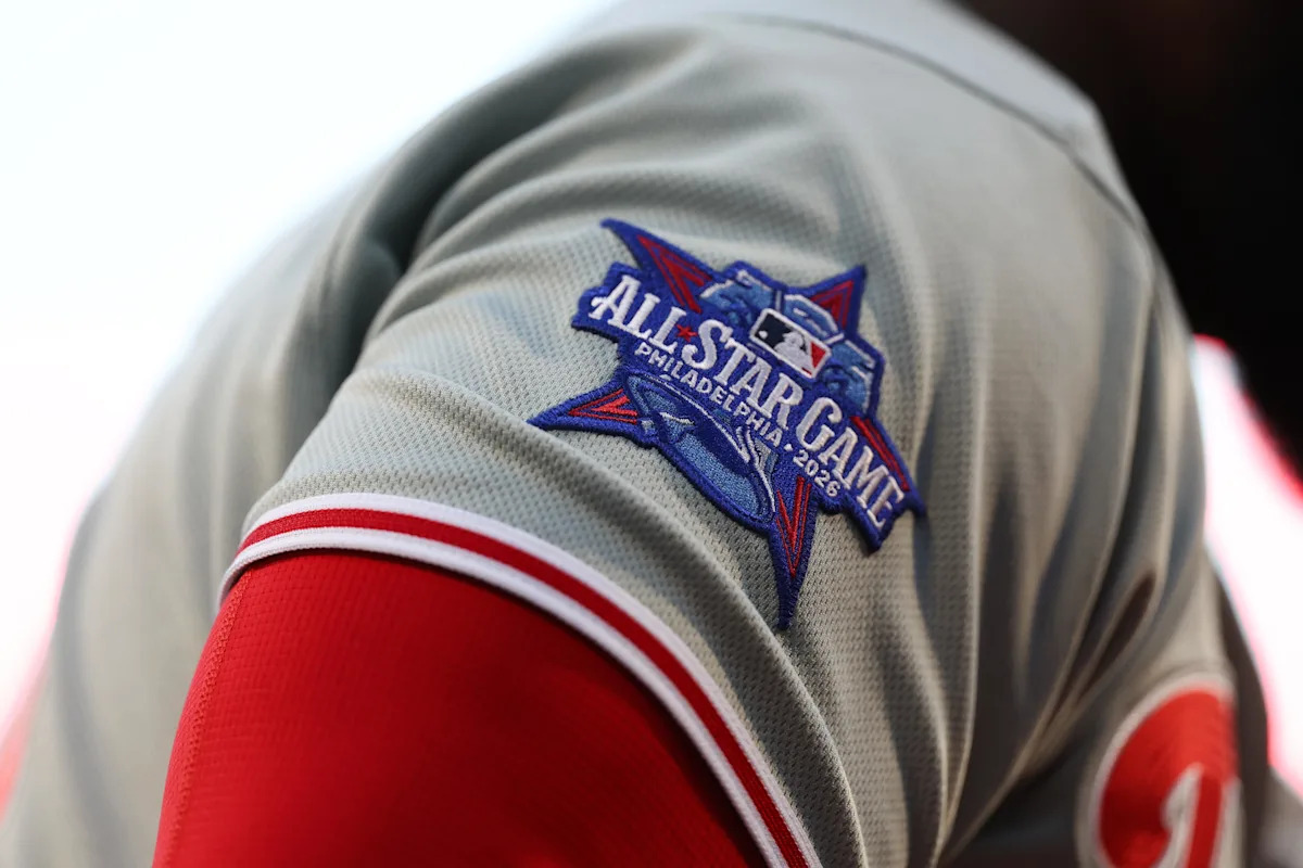
It’s a big year for voting, some have said. We’re not talking about the November kind here, though. It’s June, which means many dollars and debates are going to be centered on your very favorite baseball players. Welcome to All-Star Game voting season, folks!
I’ll get it out of the way now: the Braves really, really want you to go to braves.com/vote to send your Braves to Philadelphia. You know, the place where they swept the Phillies in April? In this first round, you can vote five times a day for the following:
No real surprises for the nine from the Braves. How serious are the whispers about writing in Jorge Mateo over Ha-Seong Kim at SS? We’ll find out.
The Braves are looking to replicate 2023, where they had a whopping eight All-Star selections including the entire infield. You could make a case for everybody (except maybe Kim and Riley) to join near-lock Ronald Acuña Jr. while just pointing to our record. Along with Drake Baldwin returning to put the finishing touches on his great start to the year, I’d love to see MHII get his first selection, and as we know, Dubie is clutch. You all can litigate who should join them while I get into what I’m really here to talk about: the social media marketing campaigns.
I made some predictions last month on what themes the Braves and other teams in the league might go with for their creative direction for 2026 in Philly. How’d that go?
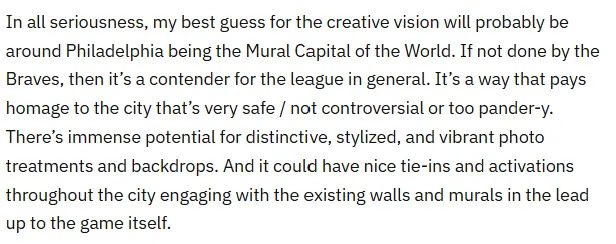
Struck out looking: USA chants intensify
As we can see, the Braves went full Founding Fathers historical portraiture. Ornate molding frames up our boys in both their media day home whites in the key graphic depicting all nine and in their tricorn-hat-finest in their individual paintings. In hindsight, I was just trying to ignore the most obvious choice. A team with a red, white, and blue-based color palette? Playing up the American history angle for Philly during America’s 250th? Yeah.
I can’t get entirely behind it. The Braves and BravesVision social teams this season have expressed a penchant for AI imagery that I don’t super-love, and that primed me to look at these key player graphics through that lens, unfortunately. It’s kind of a letdown after the creativity of years past and knowing what the department is capable of to be really examining fingers and side-eyeing some artistic inconsistencies.
Plus… this brand of America-honoring is by far the most common theme for this year’s All-Star Game campaigns. Yes, this is America’s pasttime. Yes, the ASG branding tends to be red, white, and blue even when it’s not set to be played in one of the original thirteen colonies. But by my count, a whopping half (!) are America / American history-adjacent. So many Liberty Bells!
There are some different flavors of this, and a sliding scale of how much they leaned into it. But let’s be so honest… everyone is reheating the nachos of the Washington Nationals, who just do the colors of the flag, Constitution-type font, and historical homages all the time. So many teams… just downloaded the copycat old-timey font packs and ran. Those and Declaration of Independence partchment textures are doing a LOT of heavy lifting this year. Unlike our concept, kudos to the Guardians for getting their players in costume.

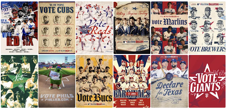
On the other hand, the Nats were hamstrung by their own brand. So they… did gritty realism, Ben-Franklin-with-a-key-and-a-kite with lighting theme? Sure!
So me not locking Braves doing American history in for my guess was mostly wishful thinking, but this still counts at me staring at the most middle-middle meatball to ever exist.
Lean wit it, Rock(y) wit it
But sometimes I know what I’m talking about!

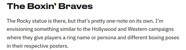
While the Braves didn’t take me up on this, the five other clubs certainly did. The San Diego Padres and Tampa Bay Rays did exactly this, with an overall boxing poster key graphic featuring all players and individualized posters.
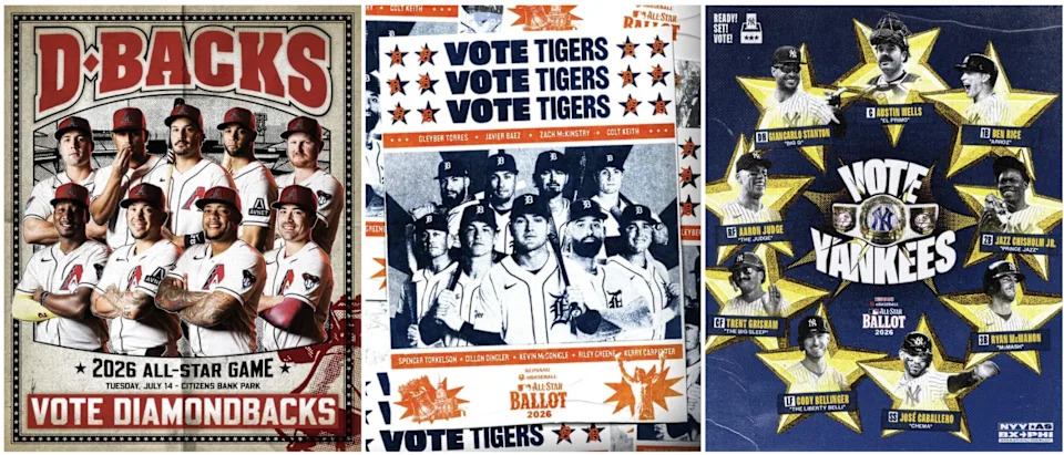
Arizona and Detroit aren’t doing it to the extent above, but they are going the poster treatment or alluding to it with boxing emojis in their captions. The Yankees went more wrestling than boxing, but it counts.

Birds of an (original) feather

If you squint, the Baltimore Orioles were the only ones to come close to my chosen mural concept with stylized overlays in poster art incorporating Philly landmarks/elements while remaining within their branding. I could see these on a wall.
The Toronto Blue Jays took an extremely Canadian angle on it and just focused on “phriendship” with yearbook-esque visuals and wholesome vibes.
The last original concept was from a non-bird, non-AL East team – the Royals did a newspaper spread with Philly references in the articles with their players. It’s different, which I’ll always applaud.
Mail it in
The remaining unmentioned teams (HOU, LAA, LAD, MIN, NYM, and SEA) didn’t execute a new or differentiated concept for their All-Star campaign, relying only on their own branding with two or fewer references to the ASG location. However, I will shout out the Rockies’ for being kind of refreshing – clean, modern, only relying on the Philly cityscape.
All in all, as much as the 2026 Braves campaign blends in with many others, I do appreciate taking the time to create separate assets per player and having a somewhat original spin. I am missing a promo video like years past, though. Make Wiley recreate Washington Crossing the Delaware or something if we’re going the paintings route.
Thus concludes my marketing audit. Mourning Walt Weiss’s Water Ice and hope the All-Star Game festivities themselves tone down the American history references, or else my dormant Hamilton phase might come back with a vengeance.
Any thoughts / favorites / hot takes? Who’s got your votes? Let us know!
Read the full article here


