MotoGP has unveiled an all-new logo that is at the centre of its brand refresh for 2025 and beyond.
The famous chequered flag logo that was first introduced in 2002 and tweaked further in 2007 has been dropped in favour of a more minimalist design by series promoter Dorna.
Revealed at the National Art Museum of Catalonia in Barcelona following Sunday afternoon’s title decider, where Jorge Martin was crowned the premier class champion, the new logo was crafted by Pentagram, the world’s largest independent design studio.
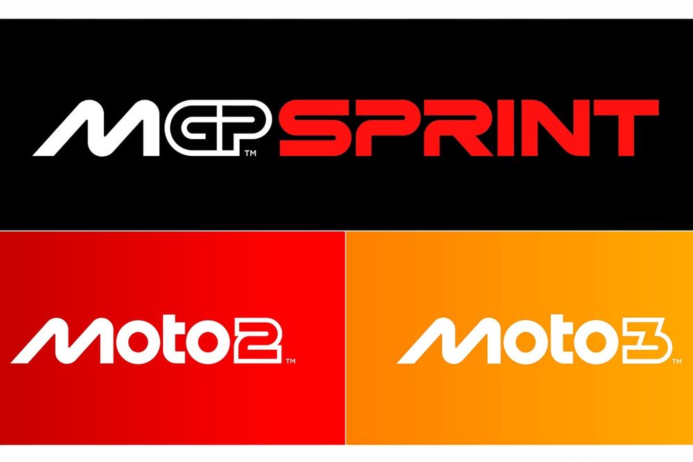
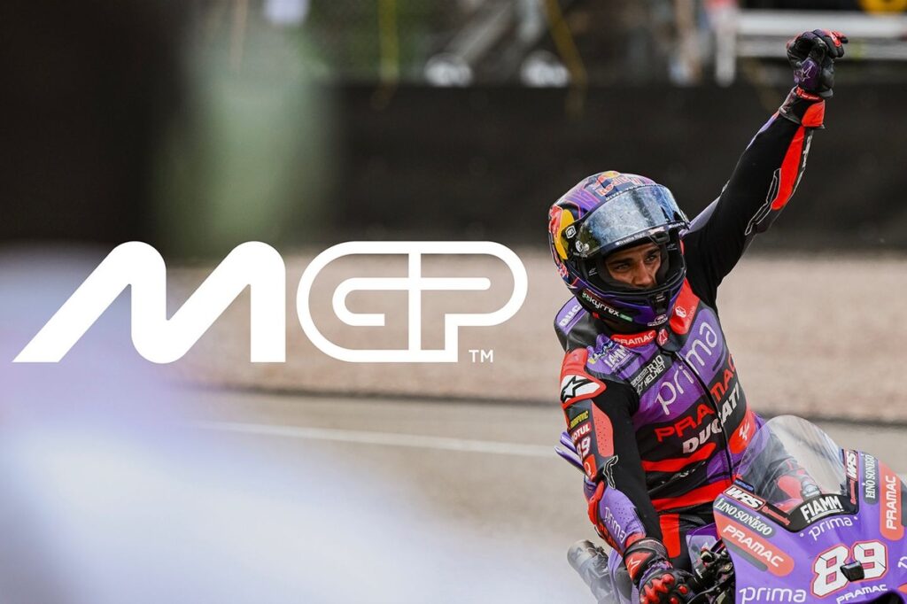
MotoGP said the ‘M’ in the new logo takes inspiration from two bikes circulating close to each other on a track at a lean angle. The ‘O’s suggest the wheels’ geometry, while ‘t’ represents the rider on the bike. The ‘GP’ part of the design is meant to evoke the layout of a racetrack.
MotoGP logo
Photo by: MotoGP
The new logo is part of a larger revamp that includes artwork, motion, typeface, visual identity and verbal identity.
The logos for Moto2 and Moto3 have also been overhauled, following the same design language as MotoGP.
“We’re very excited to reveal our new identity and invite fans around the world to meet the new MotoGP,” said Carmelo Ezpeleta, CEO of MotoGP promoter Dorna.
“Working with Pentagram has been an incredible adventure leading to what we hope our fans will agree is an incredible result.
“A brand is more than a logo, and MotoGP is more than a sport. The process has taught us a lot about both and we’re very proud to show the world the results.

MotoGP Sprint, Moto2 and Moto3 logos
Photo by: MotoGP
“The key question throughout has been, ‘What is MotoGP?’, both now and looking forward to who we want to be, and we hope this new identity communicates every aspect of that, from the speed to the passion and everything in between. This is MotoGP.”
MotoGP’s brand refresh comes at a time when Liberty Media is closing in on its acquisition of Dorna, with the American powerhouse expecting to receive all regulatory approvals by the end of the year.
Formula 1, also owned by Liberty, similarly got a new logo and brand identity in 2017.
Read the full article here

