


FANS spotted an apparent ‘error’ that gives them the “ick” in the stands at Nottingham Forest’s stadium.
But there is actually an unusual reason behind the strange quirk.
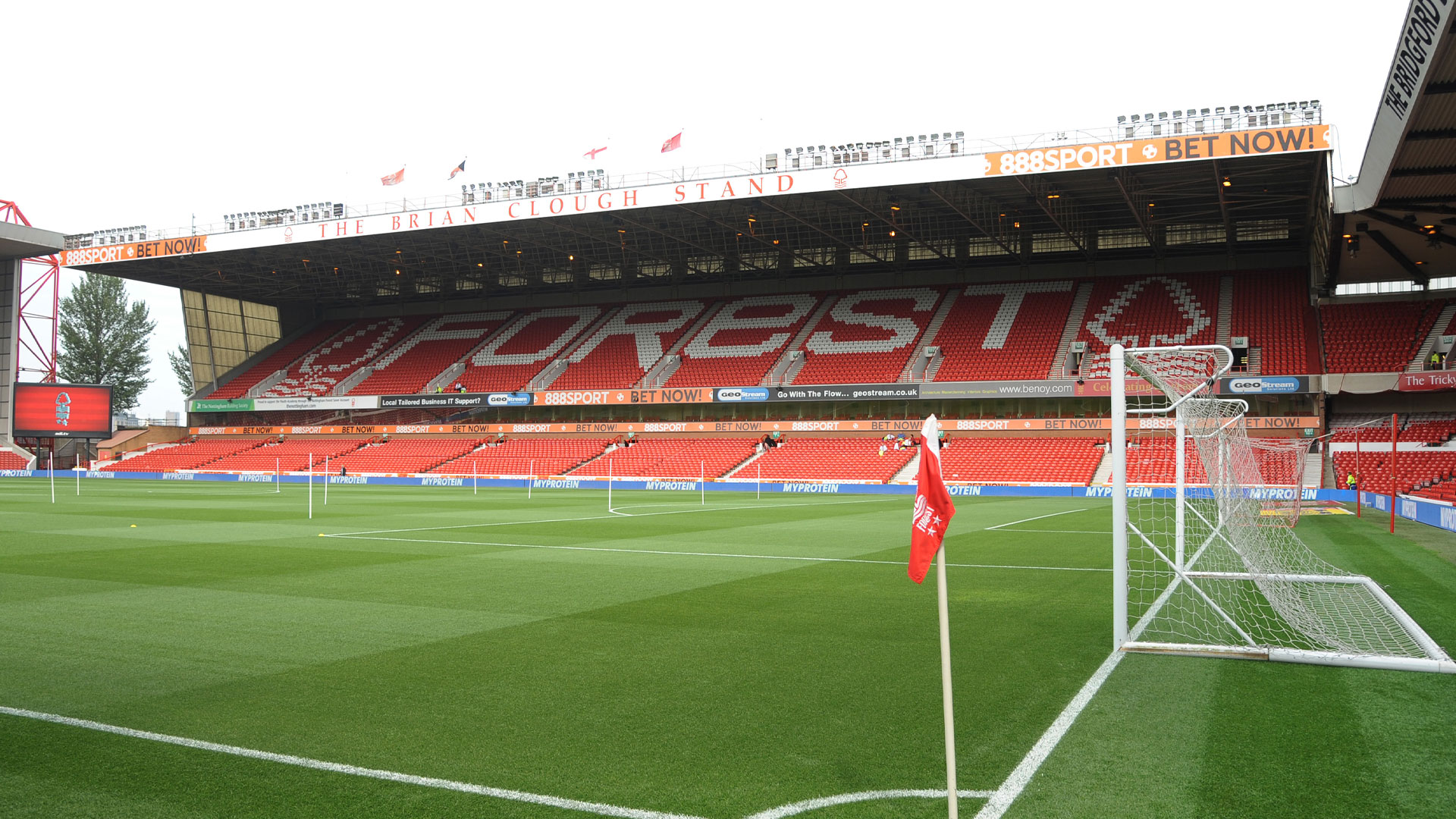
The City Ground has been in the news ahead of the final day of the Premier League season.
That is because Forest shockingly BANNED Gary Neville from commentating on their crunch clash with Chelsea as both sides try and qualify for the Champions League.
The club blocked Sky Sports’ accreditation request because Neville described Evangelos Marinakis’ public on-pitch row with Nuno Espirito Santo as “scandalous”.
Much to David Beckham’s amusement, it means Neville will not be at the City Ground on Sunday – and therefore will not see the strange grammatical ‘mistake’.
READ MORE ON NOTTINGHAM FOREST
In the Brian Clough Stand of Nottingham Forest’s home ground, a pattern of white seats spell out ‘Forest’ in between two tree badges.
But while the ‘f’, ‘o’, ‘r’, ‘s’ and ‘t’ are all in capital letters, the ‘e’ is lower case as the odd one out.
The format is the same on the club’s crest, too.
And it sparked a message on social media surrounding the odd decision.
One person wrote: “Bit of an ick this but I really can’t work out why they have left the letter ‘e’ lower case but capitalised the rest?
“Surely there’s some ‘dull excuse’ behind all this?”
However, there is an explanation.
The design has been in place since 1973 after fan and calligrapher David Lewis won a competition to create a new badge for the club.
Explaining the ‘e’, he told Nottinghamshire Live: “If you’ve got the badge on top and the word Forest underneath, the word Forest needed to be distinctive and individual.
‘The original idea had a very round ‘o’. I then got on to the more condensed letters, which seemed to have a bit more solidity and link to the badge.
“It so happened that the lower case ‘e’ does fit in between the ‘R’ and the ‘S’ rather than a straight ‘E’.
‘SERIF OF NOTTINGHAM’
“Also, I wanted it to be a bit more personal – a bit less like a company and more like a football club.
‘It’s a unique Forest then, rather than anybody’s Forest.
“Then wrapping the tail of the ‘r’ around it was almost like an affectionate thing. It was something which was more personal.
“That was the idea, to make things more personal, more unique, more like it’s our Forest, not just the word ‘Forest’.”
The reasoning is well known by Forest fans – and there were plenty of replies to the post on Facebook.
One said: “It’s a logo, if it caught your attention then it’s worked.”
Another wrote: “Because we’re Forest and we do what we want.”
A third added: “It just looks cool like that.”
And a final user very cleverly joked: “It’s the font. Serif of Nottingham.”
Read the full article here


